

FEATURE
RAE MORRIS
WE’RE EXCITED TO PRESENT THE VISIONARY BEAUTY DIRECTOR <Rae Morris> FOR <Alice.Curated> AS SHE BRINGS THE THEME OF CTL ALT DEL TO LIFE FOR ISSUE 11. THROUGH THREE TRANSFORMATIVE LOOKS, SHE BLENDS PRECISION, BOLD EXPERIMENTATION, AND A DEEP RESPECT FOR THE ART OF MAKEUP.
IN THIS FEATURE, WE DELVE INTO RAE’S ARTISTIC PHILOSOPHY, WHICH IS ROOTED IN HER PASSION FOR INNOVATION ANDCOLLABORATION. AS SHE INVITES US INTO HER CREATIVE PROCESS, WE TAKE MOMENTS TO REFLECT ON HER COMMITMENT TO CHALLENGING CONVENTIONS AND USING MAKEUP AS A TOOL FOR STORYTELLING, CULTURE, AND CREATIVE EXPRESSION.
<Recorded Over Zoom 10.03.25>
Alice.D> Hi, Rae, how are you?
<Rae Morris> I’m amazing, how are you?
<AD> I’m great. I’m excited to talk to you about your editorial and thank you for being part of Alice.Curated.
<RM> Thank you for having me.
<AD> Personally, I’ve had an absolute blast collaborating with you over the last few months. There was this remarkable openness to your process and a genuine encouragement to experiment on set, which is something we value so highly at Alice.D. Is this an approach you’ve always embraced in your career, or something you’ve discovered along the way?
<RM> I’ve always leaned towards spontaneity in my creative process, but opportunities to fully embrace it have been rare. Planning months in advance has never been my strength; my most inspired ideas emerge when I’m face-to-face with the model, immersed in the environment—the clothes, the lighting, the hair. Unfortunately, not all photographers or clients are open to this on-the-spot creativity, preferring more predictable outcomes. That’s why our recent collaboration felt so liberating. Being granted the freedom to explore and create in the moment allowed me to produce work that truly resonates with my artistic vision.
<AD> You’ve built such a great team around you, and we had such an amazing crew on set, bringing their level of expertise. And although you were driving the concept, it was such a collaborative environment.
<RM> For me, it was about bringing together the right people and giving them the freedom to do what they do best. Despite the title CTL ALT DEL, I never wanted to control their process. I had a clear vision, but I trusted them to bring it to life in their own way—and they did. I’m so proud of where we landed.
“THAT’S WHY OUR RECENT COLLABORATION FELT SO LIBERATING. BEING GRANTED THE FREEDOM TO EXPLORE AND CREATE IN THE MOMENT ALLOWED ME TO PRODUCE WORK THAT TRULY RESONATES WITH MY ARTISTIC VISION.”
<AD> Speaking of CTL ALT DEL, it’s all about transformation and breaking boundaries. What drew you to this particular theme and how did it inspire the looks you created for the magazine?
<RM> A few things inspired me. First, discovering your magazine—completely by chance—at The StandardX in Melbourne. I remember thinking, This is divine. What is this? I was instantly drawn in. Then, when I received the brief, I was intrigued for a very different reason: I genuinely didn’t know what I’d do with it. And that’s exactly what pulled me in. When something feels complex or unclear, I lean in. If it’s too easy, the outcome risks being obvious—and I’ve never been drawn to the obvious. In a world oversaturated with makeup imagery, especially on social media, it’s easy to slip into cliché. CTL ALT DEL could have gone that way if not handled carefully. But the challenge of avoiding that, of finding a new language for it—that’s what excited me. It pushed me, and that’s where I thrive.
<AD> Wow. I didn’t know that! So, how did you come to create the looks?
<RM> When I first heard CTL ALT DEL, I saw it as three distinct ideas—and we were creating three shots. I asked myself, how do I translate CTL into makeup without taking it too seriously? Because at the end of the day, it is makeup. I wanted each look—CTL, ALT, and DEL— to feel strong, simple, and intentional. But it wasn’t until I spoke with Michael, the photographer, that something clicked. He reminded me that CTL ALT DEL is really about refreshing and restarting—and that completely reframed my thinking. That’s when the lightbulb went off.
<AD> That was our intention, it’s all about hitting reset. It’s definitely come through in the final imagery.

DIRECTION, MAKEUP and CASTING <Rae Morris>
PHOTOGRAPHY <Michael Comninus>
DIRECTION AND WORDS <Lucy Jane Brand>
STYLING <Ewan Bell>
HAIR <Kyye>
VIDEOGRAPHY <Oliver Rose>
MAKEUP ASSIST and GRAPHICS <Yasmine Keong>
MAKEUP ASSIST and POLAROIDS <Tatiana Rose>
PRODUCTION <Alice.D Studio>
PHOTO ASSIST <Matty Patek><Tim Simon>
VIDEO ASSIST <Joel Lumbroso>
STUDIO. <Lunar Studios>
MODEL <Mana Mackay><Jin Choi><Dechen>

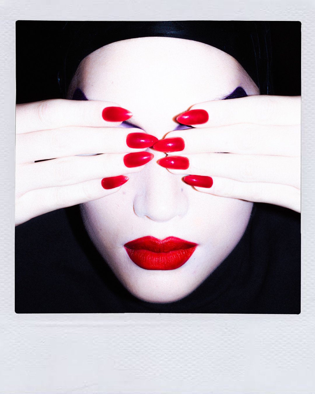


<AD> Mana’s look celebrates the pursuit of flawlessness. Is this something you’ve always strived for in your craft?
<RM> I love that our world embraces both perfection and imperfection. As makeup artists, we strive for excellence, but true flawlessness is more complex. Especially with a face like Mana’s—her skin is so pristine that even the smallest imperfection becomes visible. It raises the stakes. That challenge pushed me to give it everything. I know how many incredible artists look to these kinds of publications, and I wanted to bring my absolute best. Flawless is always the goal—but getting there is an art in itself.
<AD> I think where you stand out is your approach to colour and form. Can you talk us through your process in building Mana’s look and choosing the palette?
<RM> I love this question—because the truth is, I don’t actually like colour. But I do love it. For me, it’s the extra. My world tends to exist in black and white—very yin and yang. You won’t find soft pastels or gentle washes in my work. If I use colour, it’s bold, it’s intentional, and it makes a statement. To me, strong colour is timeless. It can feel elevated, expensive, and editorial when done right. The imagery I’ve always been drawn to—David LaChapelle, Helmut Newton—it’s high contrast, decisive, unapologetic. There’s no in-between. You either go there, or you don’t. <AD> The palette of Mana’s look, with the purples, pinks, and reds, are such visceral feminine colours, which I felt worked well to contrast the harshness of the black tape and the lighting and the rest of the storytelling.
<RM> Yes—femininity is the word. Even though the look is bold and powerful, I wanted it to carry a certain softness, a quiet beauty. I wasn’t trying to create something harsh or confronting—though I do love exploring that space sometimes. This time, I wanted something you could look at and feel drawn to. Something you’d hang on a wall, not because it’s loud, but because it lingers. Because it’s beautiful.
<AD> Makes total sense. Each shot turned into a piece of art; they’re stunning. Watching you create the flocked lip on Mana was incredible. Can you share more about how you developed this technique?
<RM> Returning to the idea of restart and refresh, I wanted this to feel like a reset for the industry—a quiet reminder of where we came from. A time when everything was done by hand, when craft took time, and makeup was about pushing creative boundaries. So I asked myself, What’s something I’ve never done before? That’s the question I try to bring to every shoot. I knew I wanted a red lip—I’ve always loved a red lip—but we’ve all seen it a thousand times. The challenge was, How do I make it new? That’s where the idea of texture came in—specifically the texture of a tennis ball. Someone mentioned “flocking,” the technique they use to create that velvety surface. It wasn’t easy. It involved staticelectricity—Mana had to hold a charge while I held the opposite—and the particles would attract to her lips. It was complex, experimental, and honestly a little risky. But that’s what I loved about it. I didn’t want it to be simple. I wanted to create something that, when you look at the final image, you can feel the work behind it. A celebration of the craft, the detail, the risk—and what’s possible when we’re allowed to truly create. <AD> I loved watching you bring that look to life in real time.
<RM> I believe we do our best work when we’re not afraid to make mistakes, because that’s when real creativity happens.
<AD> When you’re working with experts like yourself, that fail bracket is quite small. Even though it was our first shoot together, your history and work speak for itself. So, there was absolutely no doubt in my mind that we would get a shot in some way, shape or another. <RM> Creative collaborations thrive when platforms like Alice.D offer artists the freedom and trust to explore. Over time, I’ve become adept at navigating on-set challenges, supported by a strong, reliable team. I often advise fellow artists to position themselves as the ‘weakest link’ on a shoot—not to diminish their role, but to emphasise the value of surrounding oneself with talented individuals who offer diverse perspectives. Working with someone like Michael is a testament to this approach; his unique eye often captures nuances I might overlook. There have been moments when I doubted a look, only to be amazed by his shot, realising it’s among the best I’ve seen. This experience underscores the importance of trusting in the collective synergy of lighting, angles, the model’s presence, and wardrobe—all elements that elevate the final image.
<AD> Our director Kristie and I had this exact conversation about the strength in art direction and everything coming together on set. All the little puzzle pieces. And she said the exact same thing, that when she was styling shoots, she would always love to work with people who could bring something that she couldn’t, because then you fill out the gaps.
<RM> I completely agree. I often remind aspiring makeup artists that our goal isn’t just to showcase the makeup itself, but to enhance the overall beauty of the image. Sometimes, the most impactful choice is to apply minimal or even no makeup at all. Recognizing when less is more can transform a photograph, highlighting the subject’s natural features and creating a more authentic, compelling result. It’s about understanding that subtlety can often speak louder than extravagance. The late Richard Sharah, the creative force behind David Bowie’s iconic Ziggy Stardust look, was not only my mentor but also a dear friend. He once shared a piece of wisdom that has profoundly shaped my approach to makeup artistry: “The best makeup artists know when to put the brush down.” This lesson has been instrumental in teaching me the importance of restraint and the art of knowing when a creation is complete.
<AD> I need to pause for a second, I’m having a moment because David Bowie is my style icon.
<RM> I had the incredible opportunity to see Richard Sharah’s original sketches and plans for David Bowie’s iconic looks. It was Richard who conceived the lightning bolt design for Bowie’s ‘Aladdin Sane’ persona—a testament to his visionary creativity. Remarkably, despite being slightly colourblind, Richard had an extraordinary ability to use colour in groundbreaking ways. Being his last student before his passing was both an honour and a profound influence on my own approach to makeup.
<AD> Iconic. David Bowie is the one person I would sit down and have dinner with dead or alive.
<RM> Maybe in another life.


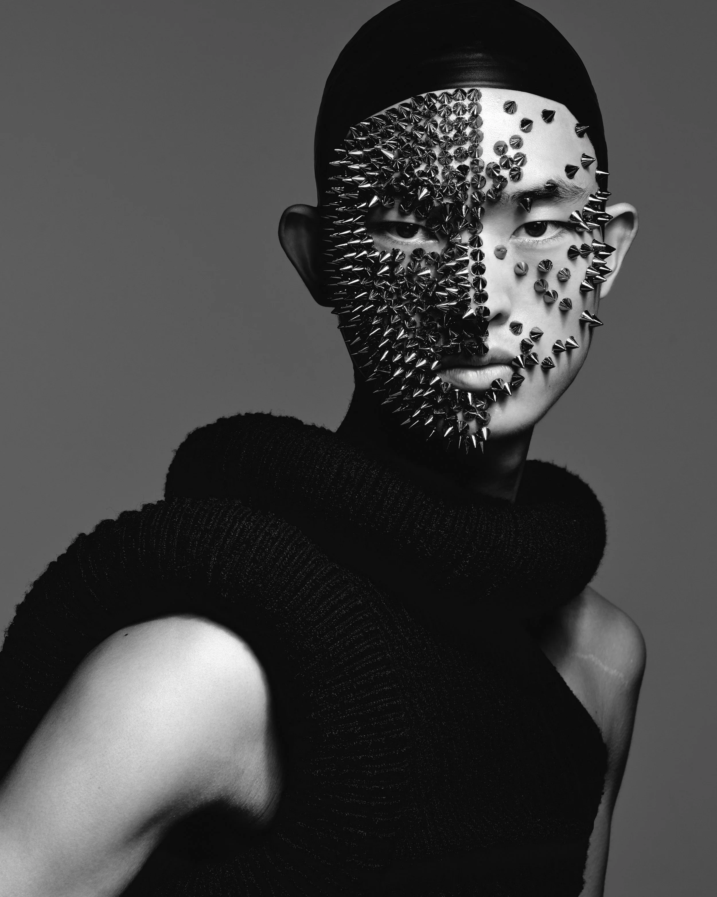
<AD> In Jin’s look, his face becomes an abstract canvas, transformed into a dynamic art piece. Why do you think it’s important to push the boundaries of creativity and present beauty in such an avant-garde way?
<RM> We’re lucky—we get to create, to be excited by our work, and hopefully inspire others through it. With this project, I didn’t start by asking, What makeup look do I want to create? I asked, What could I create that still holds beauty, even as a deletion or a restart? I kept thinking about opposites—how to make something avant-garde, but still human. It all began with an image I saw of a face completely erased. And I thought, What if a makeup artist could delete a face—not digitally, but with the craft itself? At first, I imagined covering the face with jewellery or studs, but that felt too familiar. So I began experimenting—spiky red metallic pieces that, at first, felt a bit like Christmas decorations. But then I saw potential in their shine, in how metal reflects and reshapes form. I loved the idea of erasing Jin’s face—but still seeing him. In the deletion image, he’s presence is still there. It reminded me of the structure beneath the skin—the bones, the X-rays, the layers. With Yasmine, my graphic designer, we blew out the details but kept the essence. It became a study in removal, in restarting, while still holding onto identity.
“YOU JUST KNOW WHEN YOU SEE A GREAT SHOT. IT’S THAT GUT FEELING. I THINK THAT’S WHAT MAKES A REALLY GREAT CREATIVE, OF WHATEVER BACKGROUND YOU’RE IN – YOU JUST KNOW WHEN IT’S A GOOD SHOT.”
<AD> Jin’s deletion image, it’s stunning. Could you tell us about the post-production process that you and Yasmine worked on and what goes into finalising an image like this?
<RM> Collaborating with a talented graphic designer like Yasmine is as crucial as selecting the right hairstylist or photographer. I believe it’s essential to celebrate the graphic design aspect of creating such images. In an era where many emerging makeup artists might rely on quick filters, the depth of our work on Jin’s deletion image stands in contrast. We invested around 80 hours, meticulously refining the concept through continuous collaboration. While each iteration Yasmine produced was impressive, achieving the perfect balance took time. The final result resonated because, despite the transformative elements, Jin’s essence remained visible; his features subtly emerged, preserving the human form. It was imperative to integrate this seamlessly with Michael’s original photograph, ensuring the core of his vision remained intact. Throughout the process, we consistently sought Michael’s feedback, valuing his perspective to maintain the image’s authenticity.
<AD> I remember seeing Michael get the lighting right for that image, and you could hear us all audibly breathe in at the same time. And we were just like, It’s there, we’ve got it.
<RM> You know, it’s funny how each of us brings our own strengths to a project, but there’s this shared moment when everything just clicks. You just know when you see a great shot. It’s that gut feeling. I think that’s what makes a really great creative, of whatever background you’re in – you just know when it’s a good shot. And it’s never just about the makeup. I mean, the makeup could be spot-on, but if the model’s mid-blink or not really engaged, the shot falls flat. The best beauty images? They’re all about that connection. It’s like taking the model on this marathon journey with you, building that trust and emotion over hours. By the end of it, you’re both exhausted—it feels like you’ve packed months into a single day.


PANTS and SHOES <Prada>
TOP <Acne Studios via Net-A-Porter>
<AD> Dechen’s look takes innovation to the next level. What inspired you to explore projections and light for this particular look? <RM> As makeup artists, we’re always looking for ways to push boundaries and redefine beauty. For this project, I kept asking myself, How can I take an image and truly ‘CTL ALT DEL’—reset and refresh it? Photographers often get excited about lighting, and Michael and I were particularly drawn to the idea of using light projections. We experimented with different patterns, and one of the first images that appeared reminded me of Vermeer’s Girl with a Pearl Earring—so angelic that I could see it hanging on my wall. Then, projecting her own image onto her face created this mesmerising effect, as if she were wearing herself. It was an incredible way to showcase makeup, blending art and technology to create something truly unique.
<AD> You were busy working on Mana’s makeup while Michael and I were workshopping a bunch of things on set. I remember when you popped back in and we had the face projected back on Dechen. You were speechless.
<RM> There was this one shot where everything just clicked. The model’s face became the background, her outfit transformed into her eye—it was a visual symphony that truly celebrated the makeup I’d created. The styling was spot-on, providing the perfect canvas for that image. Moments like these highlight the magic of open, collaborative work on set. It’s rare, but when it happens, you just know it’s right. <AD> I like to see things in camera, as it transforms everything. Let's just get it in front of the camera and see where we're at. <RM> It’s funny how sometimes the simplest makeup choices can lead to the most stunning results. With Dechen’s look, I felt a bit unsure, thinking, This isn’t bold enough. But I reminded myself—and my team—to take a breath and trust the process. She has this angelic face with bleached eyebrows, and I realised that adding more makeup wouldn’t enhance her beauty. So, I opted for minimalism, and it turned out to be perfect for the shot. It’s a reminder that sometimes, less truly is more.
<AD> It’s about knowing where to edit, right? Where to push and where not to push. Having the expertise and confidence in knowing that. That's the right look for that moment.
<RM> I'm so glad I trusted my instinct on that one.
"AS MAKEUP ARTISTS, WE’RE ALWAYS LOOKING FOR WAYS TO PUSH BOUNDARIES AND REDEFINE BEAUTY."
<AD> Lastly, I’d love to know what other techniques or mediums you’re excited to explore in the future?
<RM> I’ve been really keen to dive into the world of special effects—things like flocking have totally caught my attention. I’m also super curious about how artificial intelligence can play a role in our creative processes. Even though I’m not technically trained, there’s something about the post-production phase that really excites me. I used to think of it as a separate thing, but now I see how seamlessly it can blend with what we do. I’ve been admiring photographers like Justin Ridler for a while now—he’s amazing at merging traditional photography with modern tech to create this beautiful fusion of virtual and physical elements. I feel like there’s this fresh movement happening where artists like us can step into that space and still have full creative control. So, Justin and I have been chatting, and I’m really looking forward to collaborating with him on some exciting projects.
<AD> We love Justin. Let’s lock it in for Alice.D Issue 12?
<RM> I’ve already mentioned it to him!
<AD> Amazing, what a great collaboration.
<RM> Absolutely. Okay, that’s my next plan. How exciting.
<AD> Very exciting. Can’t wait to see what you two create for the next issue.

“IF SOMETHING TURNS OUT THE WAY YOU’VE EXPECTED IT, BE A LITTLE BIT DISAPPOINTED. YOU SHOULD ALWAYS BE PUSHING FOR SOMETHING MORE UNEXPECTED.”
